Permits & Compliance
ADA-Compliant Signs & Wayfinding: A Practical Guide for 2026

Interior signs that identify permanent rooms — restrooms, exits, stairwells, numbered offices — are regulated by the Americans with Disabilities Act (ADA). If they're wrong, they get flagged on inspection, and they're expensive to replace one at a time.
This guide walks through the rules that actually matter: tactile character rules, Braille, contrast, non-glare finish, and mounting height. Then we cover wayfinding — the design layer that turns a pile of ADA plaques into a system people can actually navigate.
What signs must be ADA compliant?
Any sign that identifies a permanent room or space must meet ADA 703 requirements. That includes restrooms, exits, stairwells, elevators, mechanical rooms, and numbered offices. Directional signs, temporary signs, and building identification signs have separate — usually lighter — requirements.
The trap: menus, room schedules, and directories are not permanent-space signs, but the room number plaque outside a conference room is. Get that wrong and you'll be pulling signs off walls at 4pm the day before an inspection.
Tactile characters — the 5 rules that matter
These are the specs inspectors carry a caliper to check. The most common failure is stroke width — bold fonts routinely test over the 15% ceiling and have to be remade.
- Sans-serif characters, uppercase only, raised 1/32 inch minimum.
- Character height 5/8 inch minimum to 2 inches maximum (measured on uppercase 'I').
- Character stroke width 15% or less of character height.
- Character spacing 1/8 inch minimum between the two closest points of adjacent characters.
- Line spacing 135–170% of character height between baselines of separate lines.
Braille — Grade 2, positioned correctly
ADA signs require Grade 2 (contracted) Braille, not Grade 1. Dots must be domed or rounded, 0.1 inch diameter, spaced per the ADA-specified matrix.
Braille goes directly below the tactile text, separated by 3/8 inch minimum. On multi-line signs, Braille goes below the entire message, not below each line. Getting this backwards is one of the most common design mistakes we correct on submitted artwork.
Contrast and non-glare finish
Characters and background must have a light-on-dark or dark-on-light 70% minimum contrast. Both surfaces must have a non-glare finish — no glossy acrylic, no polished metal.
In practice, this means matte or satin finishes only, and it rules out chrome, mirror, and high-gloss painted faces on ADA-regulated signs. A common architect request that requires a diplomatic 'not on this one' response.
Mounting height and location
Mount tactile signs 48 inches minimum to 60 inches maximum from the finished floor to the baseline of the lowest tactile character. Locate signs on the latch side of the door — never on the door itself, which can swing out of position.
If there's no wall space on the latch side (double doors, alcoves), the sign goes on the nearest adjacent wall. Leave 18 inches of clear floor space centered on the sign so someone using a wheelchair or cane can approach and read it.
Wayfinding — beyond the compliance layer
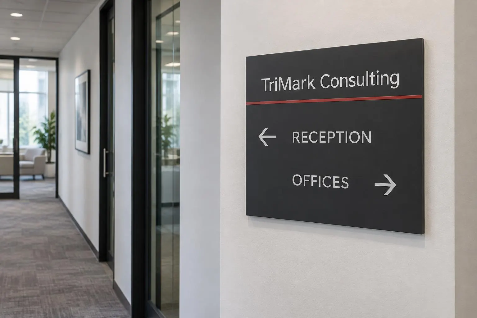
Compliance gets you legal. Wayfinding gets you findable. A great wayfinding system uses consistent placement, color-coded zones or floors, and a hierarchy of type sizes so people know where to look for what.
The three signs a good building needs, in order: (1) a lobby directory that maps the whole facility, (2) directional signs at every decision point (elevators, hallway intersections), (3) ADA room identification at every permanent-space door.
Materials we recommend
- Acrylic with second-surface digital print + tactile raster or applique — most common, best cost/quality ratio.
- Photopolymer — one-piece letters and Braille cast into the substrate, premium look, higher unit cost.
- Aluminum with etched or applique tactile — best for exterior-adjacent locations (loading docks, stairwells).
Frequently asked questions
- Do I need ADA signs if my building is under 3,000 sq ft?
- Yes. ADA sign requirements apply to any public accommodation regardless of size. Small offices, retail spaces, and clinics all need compliant restroom, exit, and room identification signs.
- Are ADA signs required at every door?
- Only at doors to permanent spaces (rooms with a name or number). Doors to temporary or infrequently used spaces (closets, storage) generally don't require ADA identification, but exit doors always do.
- Can you match ADA signs to my brand colors?
- Yes, as long as the 70% contrast rule is met and the finish is non-glare. We commonly execute ADA sign systems in brand palettes for hospitality, healthcare, and corporate clients.
Talk to ESCO Pacific
Have a sign project in mind?